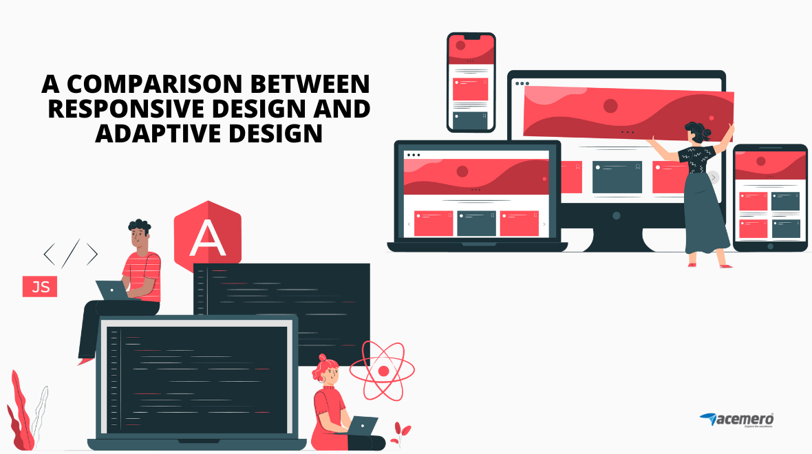
A responsive design is fluid and adapts to the size of the screen, whereas in the case of adaptive design, it uses a static layout on the breakpoint.
In the case of responsive website design, it is based on the target device’s screen size, width, height, etc., and it uses CSS queries to change the styles.
Every designer goes through the challenge of designing websites based on different devices’ screen sizes. It is actually not a simple thing. There is much confusion between responsive design and adaptive design.
You may feel both designs have the same functionality, but an experienced person, they can find the difference in the style of design.
In this blog, we will discuss the difference between responsive and adaptive design. Comparatively, responsive design takes less work to implement.
Responsive design makes use of cheap templates that are available for the majority of content management systems.
When it comes to adaptive design, it will give you the best user experience according to the device that the user is using. As the name says, it adapts to the user’s situation and needs.
While responsive design shows you a more desktop-centric approach, the adaptive design feels more relevant to the modern user experience.
You may be confused with both topics. Let’s consider them separately.
Responsive design:
In 2020, Ethan Marcotte introduced the term responsive design. It is not a separate technology; it is just a term used to describe an approach to web design.
This creates a layout that can respond to the device being used. The responsive design comes from the combination of three techniques.
- Fluid grids were the first idea.
- The second technique includes fluid images.
- Media query is the third key component.
Why do you need a responsive design?
- It requires less time to maintain a single page.
- Using a single URL, it is easier to share a link to your content.
- It is possible to reduce the common mistakes that affect mobile sites.
- It helps the Google algorithm to assign the index properties to the page.
In a web application development company, any web developer monitoring the analytics on the websites will notice an increase in traffic from mobile devices.
Responsive designers will create a single design that can be used on all screens. It generally starts in the middle of the resolution. Media queries are used to determine what adjustments will be made for the lower and higher ends of the resolution scale.
Adaptive design:
Adaptive design is actually a graphical user interface(GUI) design that will adapt to different screen sizes. Both adaptive design and responsive design are similar in that they will adapt to different screen sizes.
It has a fixed layout size and uses the best layout for the current screen size.
Why do you need an adaptive design?
- Faster loading time:
Using the adaptive design, you will be able to reduce the waiting time because websites will only load the information and features necessary for the devices.
- Improved user experience:
Users only being able to see what they want to see will result in a better user experience.
There is an option called the standalone design, which includes mobile-only website design. The approach was used once, and designers created sites for mobile devices and arranged the elements in a dedicated format. When this approach was used, Google gave ranking to mobile sites, but now Google gives preference to responsive and adaptive design.
In a stand-alone design, it has its own server space, design, content, etc. But this standalone design concept has fallen out of favor these days. Hopefully, it comes back soon.
The disadvantage of using standalone design:
- It requires high maintenance to keep track of two versions of websites.
- Difficult to customize.
- It does not search engine friendly.
- It works on the concept of Building first, learning later.

